


Easily consumable, yet packed with information, data visualization tools etherealize complex data patterns, trends, and variations. Charts, in particular, are the unsung heroes that equip businesses with the ability to understand their data better.
One such compelling tool is the histogram chart. This commonly used data analysis tool displays a frequency distribution of the occurrences of a variable, allowing you to understand the distribution form clearly. In this article, we delve deeper into the world of histograms to explore what they are, why they’re critical, how they’re made, and their application in different industries.
Understanding the Basics of Histogram Charts
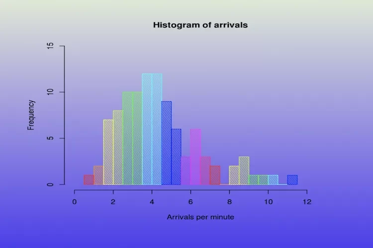
Before exploring the nitty-gritty, it’s crucial to understand what a histogram chart is. Quite simply, a histogram is a graphical representation that organizes a group of data points into a predetermined number of bins. Each bin represents a frequency distribution for a range of values, rather than just a single data point.
Unlike bar graphs, histogram charts display data in a continuous format rather than in separate categories. The data points are grouped into discreet intervals, also known as bins, that run along the horizontal x-axis. The frequency of these data points runs along the vertical y-axis. The height of the bars corresponds to the frequency of the data within each bin.
The data in a histogram can either be univariate—one-variable data—or bivariate—two-variable data. Univariate data may include things like the heights of people; bivariate data, on the other hand, can involve two pieces of data like the heights and weights of people as a comparison.
Whatever the case, the main objective is to enable easy interpretation of the underlying frequency distribution pattern of the data.
Assessing the Importance of Histogram Charts in Data Analysis
The importance of a histogram in data analysis cannot be overstated. It’s a powerful tool that assists in visualizing data distributions, spotting trends, and identifying patterns that can provide insightful observations. This allows decision-makers in businesses to make data-driven decisions.
By displaying frequency versus distribution, histograms quickly identify and visually present frequencies, patterns, and trends in the data. Histograms make it easier to understand large data sets and the relationship between different data points.
A histogram is a collection of rectangles, and the area of each rectangle represents the frequency of the corresponding bin or interval. This visual representation allows for a quick interpretation of the data’s skewness, kurtosis, and modality without complex statistical calculations.
Additionally, histograms can help identify outliers in datasets that may suggest data errors, or unique, significant entities.
Core Components that Make Up a Histogram Chart

A histogram is composed of several key components. To start, the ‘bins,’ or class intervals, are set along the x-axis. The bins correspond to a specific interval of data points in your dataset. In essence, they organize your data into categories.
The ‘bar’ is the actual graphical representation of the frequency of the data points within each bin. The height of the bars corresponds to the frequency of data points in each bin. If you look at it from an overall perspective, the height of a bar can thus be seen as a demonstration of how data is concentrated around certain value ranges.
The ‘x-axis’ of a histogram is the Range of the data. In simple terms, it is a horizontal line containing the minimum and maximum data values.
Lastly, the ‘y-axis’ of a histogram is the frequency. It denotes the number of times the observations were found to fall into each bin along the x-axis. With these components combined, a histogram chart is structured and ready for data interpretation.
Practical Steps in Creating a Histogram Chart
The process of creating a histogram chart is straightforward. Start by dividing the entire range of values into a series of intervals, often called bins or buckets. The number of bins may vary depending on the data you have.
The next step involves counting how many data points fall into each bin. This is where the data begins to take shape as a chart—the height of each bar in the chart corresponds to the quantity of the data points that fit into each bin.
Setting up the x-axis and y-axis is the penultimate step. After the data points are assigned their respective bins, decide the scale of your axes. The X-axis will have the interval boundaries, and the Y-axis will be your frequency (how many data points you counted that could go into each bin).
Finally, fill in the bars corresponding to the count of data points in each bin. An absolute representation of the frequency distribution of your data can now be perceived.
In conclusion, the histogram chart is an incredibly useful tool for visualizing and interpreting vast amounts of data. It provides a straightforward, visual representation of the distribution of a dataset, invaluable in many industries—improving efficiency, driving performance, and informing decision-making.